Tuesday, 13 May 2008
Final Live Client Work
Bachmann Junior website is completed, games and images are finally uploaded. It has now been tested and it is uploaded online. To view the website click here www.tumeiluong.com/bachmannjunior
Sunday, 4 May 2008
Personal Research Project - Artefact 5 HTML markups
As stated in theW3C Web Content Accessibility Guidelines checkpoint 9.4, it is important to create a logical tab order through links, form controls and objects.
But tabindex attribute are often neglected or forgotten by many web developers. There is an argument that when using the tabindex, a user could be misguided through a web document when using the tab key. Therefore I applied the tabindex attribute onto certain elements such as: a, area, button, input, object, select and textareas and evaluated this prototype to investigate for myself whether or not it should be in great use on every webpage.
I found this was slightly time-intensive when applying this attribute. I had to be sure the coding was correctly entered, so the web page/content flows in a logical manner or therefore the website will be in bad use for mobility impaired users. For example on the inaccessible website that I created, the tabindex was coded incorrectly. So if a user with mobility
impairment is trying to navigate their way through the website or trying to fill in a form, it will certainly be impossible for them to do that. As a result I think this attribute is very useful for users who have a condition which prevents them from making effective use of a mouse. Referring back to the argument, it could possibly misguide users. If I was to only apply a tabindex structure within the form on my website, a mobility impaired user would be navigated straight to the first tabindex when the first tab key is pressed. Therefore the user is probably expecting to be navigated straight to the first hyperlink on the page. However the problem was solved by providing an extensive structure on my website by taking site navigation and form elements into consideration. Personally, I thought tabindex works effectively on users who have difficulty with using a pointing device and it should therefore be applied on every website so every user have equal access.
Monday, 7 April 2008
Live Client Project: Layout Almost completed
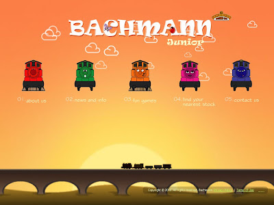
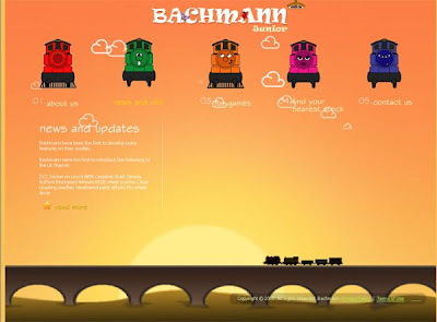
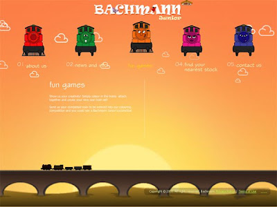
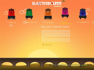
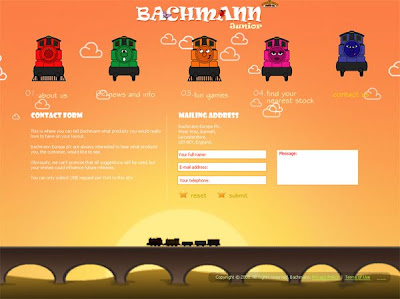
I've almost completed my final design for the Bachmann Junior website but still need to include images and activity games. As you could see previously in my draft templates, I included no clouds in the background. But i have included more interaction to my website. Below are the screenshots taken for each link:
1.Main page:
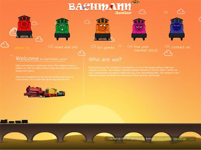
3. news and info
4. Fun Games
1.Main page:

2.About us

3. news and info

4. Fun Games

5.Find your nearest stock

6. Contact us

Thursday, 6 March 2008
Tuesday, 4 March 2008
Personal Research Project: Artefact 4 - Labelling Forms Correctly
For my fourth artefact, I discovered that forms is another top typical accessible issue on websites. Forms are one of the most crucial parts of your website. They are used to:
- Buy products
- Sign up to newsletters
- Contact you
I found that the group of users who experiences the most problems with forms is usually visually impaired users utilising screen readers. Therefore I have created a simple form, which users are able to fill in the form to recieve the latest updates on their travelguide.

Here is a good example of an accessible form:
Below shows a screenshot of my of my accessible form on my website.

Thursday, 14 February 2008
More inspirational websites
Flash websites
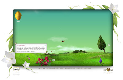
1. http://helpthehoneybees.com/
I thought this website was amazing, alot of interaction is happening on this site. I really like the interactivity on this, it is fun as you are able to drag the bumble bee to the left or right to explore the area. I love the colours that the web designer has chosen and the background sound is very soothing to hear. Everything seems calming and not too overcrowded. I think it's brilliant!
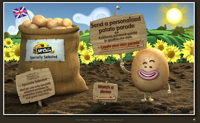

2. http://www.potatoparade.co.uk/
This is another website that i thought was excellent, it is colourful and again very interactive!
Monday, 4 February 2008
Personal Research Project: Artefact 3 -HTML markups
For this 3rd Artefact, I looked into HTML markups which is one of the typical Web Accessible issues. Alot of web sites today have been programmed to be inaccurate or incomplete HTML markup. This is one of the “typical” accessibility issues that have failed miserably when analysed through the W3C’s online mark up validators. If the document is poorly coded, users of assistive technology will find it difficult or even impossible with navigating their way through the website.
Using the W3C’s online markup validator (http://validator.w3.org) I evaluated the inaccessible homepage document to see whether or not it was poorly coded. From the results I established that there were 64 errors found. Typical issues were found, for example the incorrect html structure might look like this:

Therefore to make it accessible, I corrected the html markups by using simple codes for example:

When correcting the HTML structure in my accessibility document, it has come to my consideration that it took longer to code the web page than I thought it would be. Although the codes were very simple, I was more familiar coding the incorrect way. The correct HTML markups made a huge difference to the overall website. As the correct html coding, there is only a limited of choices to changing the font size which gives it the downfall i.e.

Whereas the incorrect html coding you are able to change the font size i.e. 
But the advantage of the standard markup would be is that the HTML document is easier to read.
Using the W3C’s online markup validator (http://validator.w3.org) I evaluated the inaccessible homepage document to see whether or not it was poorly coded. From the results I established that there were 64 errors found. Typical issues were found, for example the incorrect html structure might look like this:

Therefore to make it accessible, I corrected the html markups by using simple codes for example:

When correcting the HTML structure in my accessibility document, it has come to my consideration that it took longer to code the web page than I thought it would be. Although the codes were very simple, I was more familiar coding the incorrect way. The correct HTML markups made a huge difference to the overall website. As the correct html coding, there is only a limited of choices to changing the font size which gives it the downfall i.e.

Whereas the incorrect html coding you are able to change the font size i.e.

But the advantage of the standard markup would be is that the HTML document is easier to read.
Saturday, 2 February 2008
Live Client Project - My Designs: The layout
I used Abobe Photoshop to produce these design, the main page will look like this (see image below). Macromedia Flash will be used to produce the final outcome and many interactive features will be included to suit children ages between 3 - 8 to use. There might be changes made when I produce the final outcome.
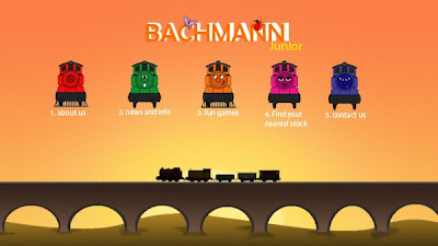
When one of the links are pressed, for example "About us". The page will now look like this:

As shown below, I used this image and turned it into a sillhouette image, which looks more realistic. This will scroll across the screen above the bridge from right to left, looking as if it is a real train travelling along the rail tracks.


Scrolling Sillhouette Train
Tuesday, 29 January 2008
Live Client Project - My Designs
Wednesday, 23 January 2008
Meeting with Bachmann Company
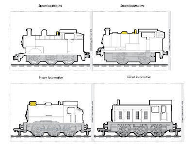
I arranged another meeting with Bachmann Company to take a few photographs of their trains sets. They gave me a couple of images to use as their colouring activity game.
1.
2.
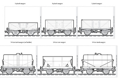
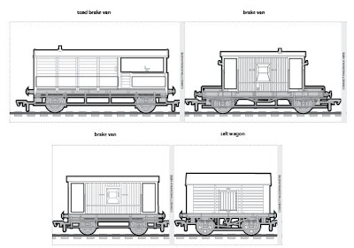


Colouring pictures
1.

2.

3.

Photographs: These were the photographs that were taken and it will be used for the bachmann junior website


Tuesday, 8 January 2008
Website Inspirations: Underground Ernie
(www.undergroundernie.com/) Underground Ernie is an animated cartoon tv series shown by the BBC on CBeebies and BBC Two. Aimed at children between the ages of 3 and 8 years old. The website is similarly to the Thomas and friends websites; colourful and highly interactive. The story is set in International Station, a fictional worldwide underground network, and focuses on the everyday adventures of Ernie, a friendly Underground supervisor, Millie, his multilingual colleague and Mr Rails the lovable maintenance man. The trains under Ernie's watchful eye all have characters of their own. There's Bakerloo, Victoria, Circle, Jubilee and the twins, Hammersmith & City. From time to time they are joined by their friends from across the world including; Paris, Brooklyn, Moscow, Sydney and Osaka.
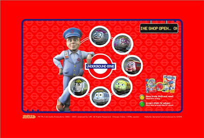
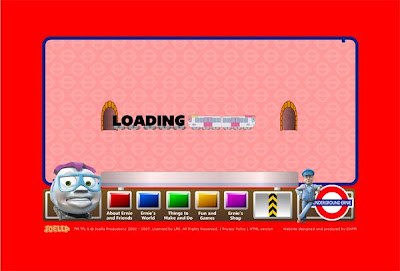
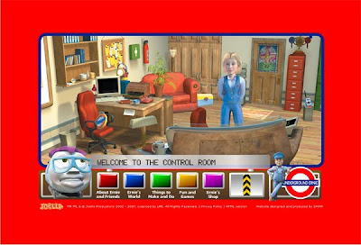


Website Inspirations: Thomas the tank engine
Whilst working on my ideas for the live client project, I came across the Thomas the tank engine's website(http://www.thomasandfriends.com/uk/thomas_the_tank_official_uk_website_intro.htm).
Intro page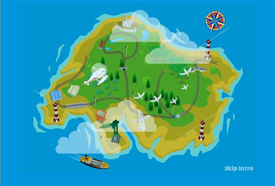
Main Page
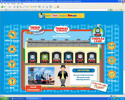
As you all should know, Thomas the Tank Engine is a fictional anthropomorphic tank locomotive created by the Rev.W.V.Awdry in his Railway Series books, made into the British children's television series Thomas the Tank Engine and Friends and its American spin-off Shining Time Station.
This website gave me alot of ideas for my bachmann junior website. The website has alot of interaction going on and the colours are perfectly suited for children ages 3 - 7. I aim to produce my website as colourful and interactive as theirs.
Intro page

Main Page

Friday, 4 January 2008
Live Client Project - Colouring train
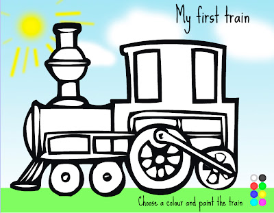
In my agreement form, my requirements mentioned that I will help build an interactive game for children to use. The screen shot below shows my colouring game for children ages between 4 - 6. There will be more games added to suit different age groups.
On the bottom right, children are able to select a colour and paint certain parts of the train. I used Macromedia flash to create this interactive game and photoshop to create the images.
On the bottom right, children are able to select a colour and paint certain parts of the train. I used Macromedia flash to create this interactive game and photoshop to create the images.

Subscribe to:
Comments (Atom)
