Thursday, 6 March 2008
Tuesday, 4 March 2008
Personal Research Project: Artefact 4 - Labelling Forms Correctly

For my fourth artefact, I discovered that forms is another top typical accessible issue on websites. Forms are one of the most crucial parts of your website. They are used to:
- Buy products
- Sign up to newsletters
- Contact you
I found that the group of users who experiences the most problems with forms is usually visually impaired users utilising screen readers. Therefore I have created a simple form, which users are able to fill in the form to recieve the latest updates on their travelguide.

Here is a good example of an accessible form:
Below shows a screenshot of my of my accessible form on my website.


Thursday, 14 February 2008
More inspirational websites
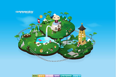
Flash websites
1. http://helpthehoneybees.com/
I thought this website was amazing, alot of interaction is happening on this site. I really like the interactivity on this, it is fun as you are able to drag the bumble bee to the left or right to explore the area. I love the colours that the web designer has chosen and the background sound is very soothing to hear. Everything seems calming and not too overcrowded. I think it's brilliant!
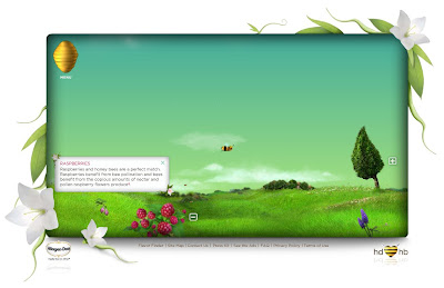
1. http://helpthehoneybees.com/
I thought this website was amazing, alot of interaction is happening on this site. I really like the interactivity on this, it is fun as you are able to drag the bumble bee to the left or right to explore the area. I love the colours that the web designer has chosen and the background sound is very soothing to hear. Everything seems calming and not too overcrowded. I think it's brilliant!
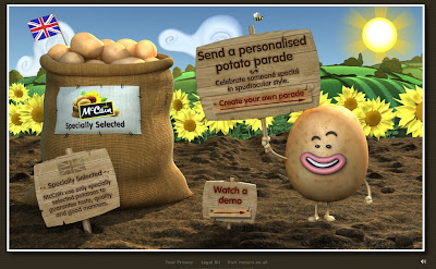
2. http://www.potatoparade.co.uk/
This is another website that i thought was excellent, it is colourful and again very interactive!
Monday, 4 February 2008
Personal Research Project: Artefact 3 -HTML markups
For this 3rd Artefact, I looked into HTML markups which is one of the typical Web Accessible issues. Alot of web sites today have been programmed to be inaccurate or incomplete HTML markup. This is one of the “typical” accessibility issues that have failed miserably when analysed through the W3C’s online mark up validators. If the document is poorly coded, users of assistive technology will find it difficult or even impossible with navigating their way through the website.
Using the W3C’s online markup validator (http://validator.w3.org) I evaluated the inaccessible homepage document to see whether or not it was poorly coded. From the results I established that there were 64 errors found. Typical issues were found, for example the incorrect html structure might look like this:

Therefore to make it accessible, I corrected the html markups by using simple codes for example:

When correcting the HTML structure in my accessibility document, it has come to my consideration that it took longer to code the web page than I thought it would be. Although the codes were very simple, I was more familiar coding the incorrect way. The correct HTML markups made a huge difference to the overall website. As the correct html coding, there is only a limited of choices to changing the font size which gives it the downfall i.e.

Whereas the incorrect html coding you are able to change the font size i.e. 
But the advantage of the standard markup would be is that the HTML document is easier to read.
Using the W3C’s online markup validator (http://validator.w3.org) I evaluated the inaccessible homepage document to see whether or not it was poorly coded. From the results I established that there were 64 errors found. Typical issues were found, for example the incorrect html structure might look like this:
Therefore to make it accessible, I corrected the html markups by using simple codes for example:
When correcting the HTML structure in my accessibility document, it has come to my consideration that it took longer to code the web page than I thought it would be. Although the codes were very simple, I was more familiar coding the incorrect way. The correct HTML markups made a huge difference to the overall website. As the correct html coding, there is only a limited of choices to changing the font size which gives it the downfall i.e.
Whereas the incorrect html coding you are able to change the font size i.e.
But the advantage of the standard markup would be is that the HTML document is easier to read.
Saturday, 2 February 2008
Live Client Project - My Designs: The layout
I used Abobe Photoshop to produce these design, the main page will look like this (see image below). Macromedia Flash will be used to produce the final outcome and many interactive features will be included to suit children ages between 3 - 8 to use. There might be changes made when I produce the final outcome.

When one of the links are pressed, for example "About us". The page will now look like this:

As shown below, I used this image and turned it into a sillhouette image, which looks more realistic. This will scroll across the screen above the bridge from right to left, looking as if it is a real train travelling along the rail tracks.


Scrolling Sillhouette Train
Tuesday, 29 January 2008
Live Client Project - My Designs
I was particularly inspired by thomas the tank engines images. So I designed these cartoon train images below using Adobe Illustrator for my Live Client Project: Bachmann Junior Website.


Wednesday, 23 January 2008
Meeting with Bachmann Company
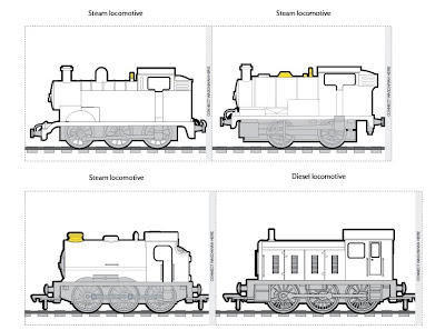
I arranged another meeting with Bachmann Company to take a few photographs of their trains sets. They gave me a couple of images to use as their colouring activity game.
1.
2.
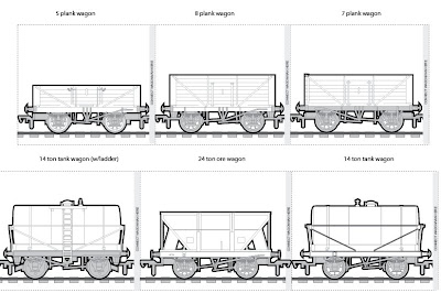
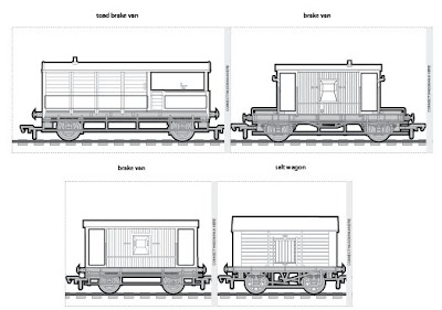


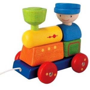
Colouring pictures
1.
2.
3.
Photographs: These were the photographs that were taken and it will be used for the bachmann junior website

Subscribe to:
Posts (Atom)